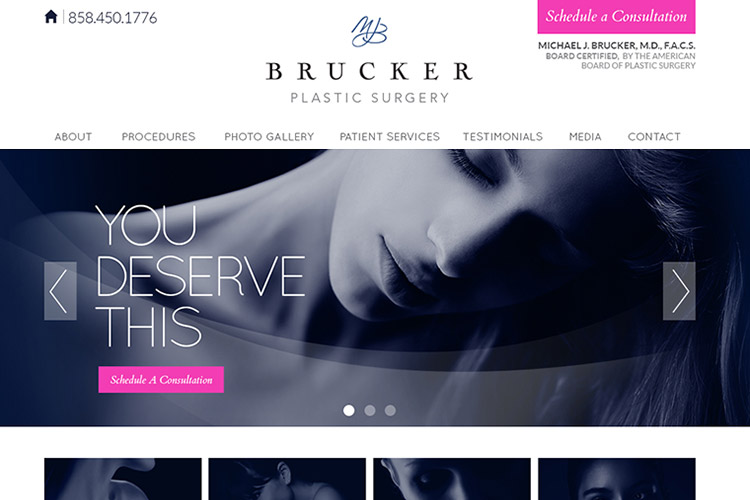
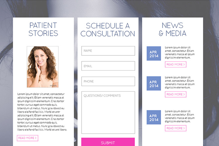
The client needed a website update that retained certain elements of their branding and kept a sophisticated, professional tone. It was important to convey a sensitivity to their patients and avoid the use of gimmicks and flashy design. A new concept was introduced using a clean layout with a limited color palette and duotone photography. Paired with a more user-friendly information flow, the new site sets them apart.

Previous Project
.jpg)
+
VIEW DETAILS
Worldlink Integration
|
Website Design
Next Project
+
VIEW DETAILS
Living Earth Crafts
|
Print Design